Situation Definition:
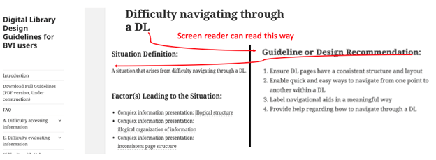
A situation that arises from difficulty navigating through a DL.
Factor(s) Leading to the Situation:
-
- Complex information presentation: illogical structure (text with tooltip) A DL does not present the organization of page elements in a rational way within or across DL page(s).
- Complex information presentation: illogical organization of information (text with tooltip) A DL does not present information topics in a rational way.
- Complex information presentation: inconsistent page structure (text with tooltip) Different pages of the DL organize their content and navigation structure differently.
Guideline or Design Recommendation:
-
- Ensure DL pages have a consistent structure and layout
- Enable quick and easy ways to navigate from one point to another within a DL
- Label navigational aids in a meaningful way
- Provide help regarding how to navigate through a DL
Rationale and Objective:
BVI (text with tooltip) The acronym for Blind and Visually Impaired, and it refers to BVI users who rely on screen readers to understand DL content. users depend on the text and structural information to understand and navigate a DL page structure. It may be helpful to use meaningful tags — called semantic markup (text with tooltip) It is a way of coding or structuring HTML elements in a website for clearly describing HTML elements’ meaning or purpose in a human-readable and machine-readable. — such as <blockquote>, <p>, <em>, and <h> rather than presentation-based HTML (text with tooltip) The acronym for HyperText Markup Language – the language in which many web pages are written would be used for sighted users. Also, DL web pages are composed of several regions. Each region should function according to a specific purpose, and the page structure should be designed with a logical flow. HTML 5 and ARIA (text with tooltip) The acronym for Accessible Rich Internet Applications. It is a set of attributes that define ways to make web content and web applications more accessible to people with disabilities. landmarks for a region can be used for ease of navigation by a screen reader (1) (2). The page structure should be designed with a logical flow (3)(4). The main navigation menu should be consistently located in the top area of the page where a screen reader (text with tooltip) A software program that reads textual information through synthesized speech, and it offers specialized keyboard commands to operate a computer interface can read it first. Each menu category should include specific sections (5). Some navigation aids, such as breadcrumbs, may help BVI users navigate the site (6). Links should be named in a meaningful way using labels rather than URLs. Adding internal links to important features, such as search results and metadata (text with tooltip) Commonly called ‘data about data,’ it includes structured data to describe and organize resources in the digital environment and enables users to discover and use the content of digital libraries. for a particular item, may be helpful when those features are far from the top area. Important items and sections should be at the start and/or the end of the web page, which are more recognizable for BVI users. Adding HTML elements, such as skip-to-links that direct the assistive technology to skip over design elements or information not pertinent to the page or the search, might be useful for BVI users (7).
Techniques and Methods:
1.1. Incorporate a consistent top menu across a DL, consisting of no more than 10 items and grouping items if there are more than 10
1.2. Position important items at the beginning of a DL page (See example 1.1/1.2)
1.3. Use a single column text layout to the main content page
2.1. Provide breadcrumbs for navigation
2.2. Provide internal links, headings, and landmarks for quick navigation
2.3. Provide a sitemap with hyperlinks to each page
2.4. Use
HTML
(text with tooltip)
The acronym for HyperText Markup Language – the language in which many web pages are written
code semantically to facilitate navigation
3.1. Provide a
label
(text with tooltip)
A classifying phrase or name applied to elements and functions; a tag in HTML that denotes a specific portion of code
or an alt text for each navigation aid to specify its function
3.2. Use
ARIA
(text with tooltip)
The acronym for Accessible Rich Internet Applications. It is a set of attributes that define ways to make web content and web applications more accessible to people with disabilities.
-labels to provide unique names for screen readers, avoiding the use of ARIA-hidden attributes on an element, which makes elements inaccessible to screen readers and other assistive technologies
3.3. Provide meaningful titles as section headers with heading tags to support navigation
4.1. Provide navigation tips and instructions regarding how to use navigation aids within and across DL pages
Recommended Features:
1.1. Navigation bar/menu (See example 1.1/1.2)
1.3. Single-column text layout (See example 1.3)
2.1. Breadcrumbs (See examples 2.1.a and 2.1.b)
2.2.a. Internal links/ Skip to Content links (See example 2.2.a)
2.2.b. Headings (See example 2.2.b)
2.2.c. Landmarks (See example 2.2.c/3.2)
2.3. Sitemap with hyperlinks (See example 2.3)
2.4. Named Anchors (See example 2.4)
3.1./3.3. Meaningful labels (See example 3.1/3.3)
3.2. HTML 5 and ARIA landmarks with names (See example 2.2.c/3.2)
4.1. Navigation tips and instruction (See example 4.1)
Examples:
1.1/1.2. Navigation bar/menu and position important items at the beginning of a DL page: Good design
HathiTrust provides a consistent top menu bar on any page, and the position of important items (e.g., home, help, and search box) are located at the beginning of a DL page.
1.3. Single-column text layout: Bad design
If a content page uses two columns side by side, a screen reader might misread it.
2.1.a. Breadcrumb: How-to example
breadcrumb: <nav aria-label= “Breadcrumb” class= “breadcrumb”><li> <a href= “./index.html” aria-current= “page”> Breadcrumb Example </a> </li>
For more: https://www.w3.org/TR/wai-aria-practices/examples/breadcrumb/index.html
2.1.b. Breadcrumb: Good design
Breadcrumb including results path (Europeana, 2018)
2.2.a. Internal link/ Skip to Content: Good design
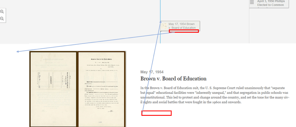
Invisible links added: “Skip to event details” and “Return to thumbnail” for an item
DPLA provides “Skip to Main Content” link at the top of the page.
2.2.b. Heading: Good design
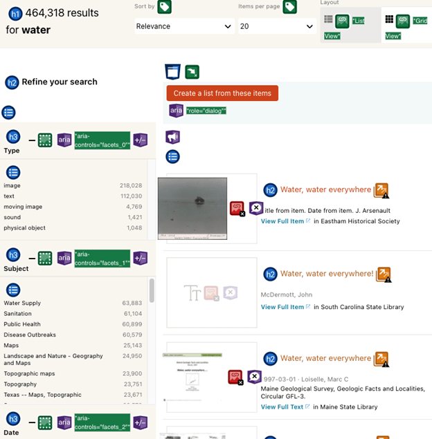
DPLA uses headings for main contents such as search results (h1), search features (h3) in the filter section “Refine your search,” and item names (h2) in the search results list.
2.2.c/3.2. HTML 5 elements and corresponding ARIA roles: How-to example
e.g., HTML 5 elements and possible corresponding roles
<header> – role= “banner”,
<nav> – role= “navigation”,
<main> – role= “main”,
<footer> – role= “contentinfo”, role = “search”,
<aside> – role= “complementary”,
<form> – role= “form”
e.g., Apply <section> and ARIA Role role= “region”
<header role= “banner”> <p> logo, etc. here </p> </header>
<nav role= “navigation”> <ul> <li> navigation </li> </ul> </nav>
<main role= “main”> <p> main content area </p> </main>
<footer role= “contentinfo”> <p> copyright, etc. here. </p> </footer>
2.3. Sitemap: Good design
Sitemap for BVI users (Library of Congress)
2.4. Named Anchors: How-to example
The following example is from tagindex.net. Use named anchors <a> and then add attributes (name, href) and values. A unique anchor name must be used within a page.
<h1>TAG index</h1>
<h2>Anchor example</h2>
<h3><a name= “menu”>Menu</a></h3>
<ul>
<li><a href= “#a001”>Jump to a001</a></li>
<li><a href= “#a002”>Jump to a002</a></li>
<li><a href= “#a003”>Jump to a003</a></li>
</ul>
<h3><a name= “a001”>a001</a></h3>
<p>paragraph text …</p>
<h3><a name= “a002”>a002</a></h3>
<p>paragraph text …</p>
<h3><a name= “a003”>a003</a></h3>
<p>paragraph text …</p>
<hr>
<p><a href= “#menu”>Jump to Menu</a></p>
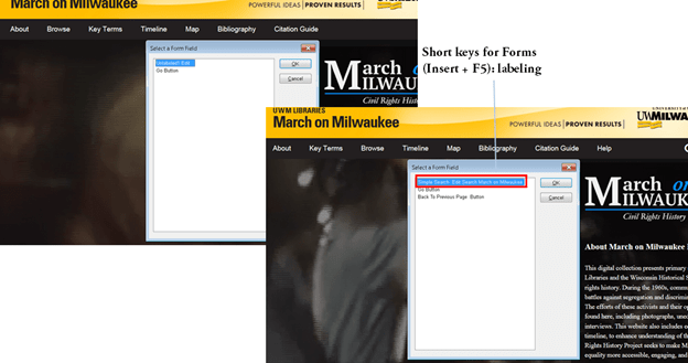
3.1/3.3. Meaningful labels: How-to example
Apply labels to unlabeled edit field -> label (Simple Search Edit Search March on Milwaukee)
4.1. Navigation tips and instruction: Good design
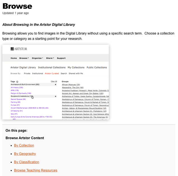
Artstor provides navigation tips and instructions on the general Help page.
Related Resources:
-
- HTML 5 Accessibility. HTML 5 and ARIA Landmark. Retrieved from https://dequeuniversity.com/assets/html/jquery-summit/html5/slides/landmarks.html.
- Surfing the Internet with JAWS and MAGic!. (2011). Navigating Web Pages. Retrieved from http://doccenter.freedomscientific.com/doccenter/doccenter/rs25c51746a0cc/2011-04-05_surfsuplessonone/04_navigating.htm
- Lynch, P. J. & Horton, S. (2017). Web style guide 3rd edition. Retrieved from http://webstyleguide.com/wsg3/6-page-structure/3-site-design.html
- Nielsen, J. and Li, A. (2017). Mega Menus Work Well for Site Navigation. Retrieved from https://www.nngroup.com/articles/mega-menus-work-well/
- Borysowich, C. (2007). Designing Website Navigational aids. Retrieved from https://it.toolbox.com/blogs/craigborysowich/designing-website-navigational-aids-123107
- Web Page Mistakes. (2018). Website Navigation. Retrieved from http://www.webpagemistakes.ca/website-navigation/
- Deque University. Add a “Skip Navigation” Link to Help Keyboard Users Reach Main Content Faster. Retrieved from https://dequeuniversity.com/tips/add-skip-navigation-link.
- Crestodina, A. (2017). Website Navigation: 7 Best Practices, Design Tips and Warnings. Retrieved from https://www.orbitmedia.com/blog/website-navigation/
- Europeana. (2018). Breadcrumb including results path. Retrieved from https://www.europeana.eu/portal/en/record/2064109/Museu_ProvidedCHO_Spielzeugmuseum_der_Stadt_N_rnberg__Museum_Lydia_Bayer__67267__Datensatz_.html?q=rabbit
- Park, K., Goh, T., & So, H. J. (2014, December). Toward accessible mobile application design: developing mobile application accessibility guidelines for people with visual impairment. In Proceedings of HCI Korea (pp. 31-38). Hanbit Media, Inc.
- The Library of Congress – Sitemap. (2018). Retrieved from https://www.loc.gov/nls/site-map/
- Wang et al. (2017). Enabling Independent Navigation for Visually Impaired People through a Wearable Vision-Based Feedback System. IEEE International Conference on Robotics and Automation. Retrieved from https://groups.csail.mit.edu/drl/wiki/images/f/fb/Wearnavi-vision-icra2017.pdf.
- Webpagefx. (2013). Designing the Perfect Hyperlink — It’s Not as Simple as You Think. Retrieved from https://www.webpagefx.com/blog/web-design/hyperlink-design/
- W3C. (2018). WCAG 2.1 Guideline 2.4 Navigable. Retrieved from https://www.w3.org/TR/WCAG21/#navigable
- W3C. (2016). ARIA Landmarks Example. Retrieved from https://www.w3.org/TR/wai-aria-practices/examples/landmarks/region.html
- W3C. (2018). Providing a site map. Retrieved from https://www.w3.org/WAI/WCAG21/Techniques/general/G63.
- W3C. Supported States and Properties. Retrieved from https://www.w3.org/TR/wai-aria-1.0/states_and_properties#aria-hidden
See Also:
Help-seeking Situations > E. Difficulty identifying current status, path, or cursor mode


