Situation Definition:
A situation that arises from a user’s disorientation within the overall structure, layout, or browse categories of a DL.
Factor(s) Leading to the Situation:
-
- Complex information presentation: excessive information or features (text with tooltip) A DL presents too much information at once.
- Complex information presentation: illogical structure (text with tooltip) A DL does not present the organization of page elements in a rational way within or across DL page(s).
- Complex information presentation: illogical organization of information (text with tooltip) A DL does not present information topics in a rational way.
- Complex information presentation: inconsistent page structure (text with tooltip) Different pages of the DL organize their content and navigation structure differently.
- Inadequate knowledge: non-DL IR systems (text with tooltip) Users have insufficient experience using a non-DL IR system.
- Inadequate support: contextual cues (text with tooltip) Content surrounding an inaccessible or incomprehensible item does not assist a user in understanding what this item entails.
- Inappropriate labeling: active elements (text with tooltip) Existing label of an active element does not clarify its purpose/function or how to interact with it.
- Inappropriate labeling: applications (text with tooltip) Existing label of an application does not clarify its purpose/ function or how to interact with it.
- Inappropriate labeling: features (text with tooltip) Existing label of a feature does not clarify its purpose/function or how to interact with it.
- Unclear instruction: the overall structure of a DL (text with tooltip) DL does not explain what the overall structure is and/or how to use it.
- Unclear instruction: the browse categories of a DL (text with tooltip) DL does not explain what the browse categories are and/or how to use them.
Guideline or Design Recommendation:
-
- Maintain a logical hierarchical structure for a DL, including page layout, content organization, and browse categories
- Ensure that structural elements have meaningful labels (text with tooltip) A classifying phrase or name applied to elements and functions; a tag in HTML that denotes a specific portion of code
- Explain the structure of a DL and its browse categories (text with tooltip) A function or feature that organizes the digital collections in a digital library for easier skimming and indicates how to interact with its structural elements
Rationale and Objective:
For BVI (text with tooltip) The acronym for Blind and Visually Impaired, it also refers to BVI users who rely on screen readers to understand DL content. users, a complicated DL structure may pose a challenge for navigating a DL. They may be unable to recognize the structure of a DL, thereby failing to determine the appropriate course of action (1). A simple, predictive, and hierarchical structure is more easily understood. Browse categories (text with tooltip) A function or feature that organizes the digital collections in a digital library for easier skimming and indicates how to interact with its structural elements are one of the main features that allow for BVI users to interact with a DL, but due to sophisticated information presentation, browse categories may be too complicated for users, and they avoid taking this route.
Techniques and Methods:
1.1. Organize a DL from general to specific in its overall structure and browsing structure up to a maximum of three nested levels
1.2. Place the most frequently used information at the top of each level of its structure
1.4. Maintain a logical hierarchical heading structure across a DL
1.5. Maintain a consistent and simplified page layout across a DL
1.6. Provide options for
facet-based browsing
(text with tooltip)
A search feature that allows users to refine their search results by applying one or more filters of their choice, such as subjects and creators, of their choice
by subjects, creators, etc.
2.1. Assign meaningful and unique titles to individual sections of the DL
2.2. Assign meaningful and unique labels with hyperlinks for each of the
browsing categories
(text with tooltip)
A function or feature that organizes the digital collections in a digital library for easier skimming
and subcategories
3.1. Provide instruction (help) that explains the DL structure and browse category structure
Recommended Features:
1.1. General-to-specific structure (See example 1.1/1.2/1.5)
1.2. Frequently-used information at the top level (See example 1.1/1.2/1.5)
1.3.a. Single-column layout, if possible (See example 1.3.a)
1.3.b. Linear structure (See example 1.3.b)
1.4. Nested heading structure (See example 1.4/1.6)
1.5. Consistent layout (See example 1.1/1.2/1.5)
1.6. Facet-based browsing (See example 1.4/1.6)
2.1. Section titles (See example 2.1)
2.2. Meaningful browse category labels with hyperlinks (See example 2.2)
3.1. Tutorial/instruction/tips (See example 3.1)
Examples:
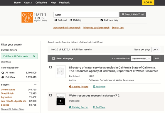
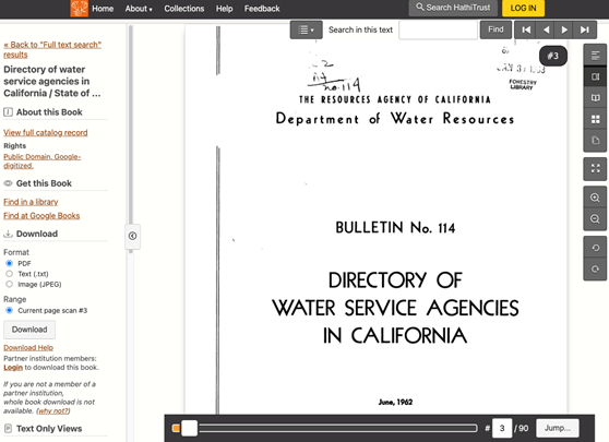
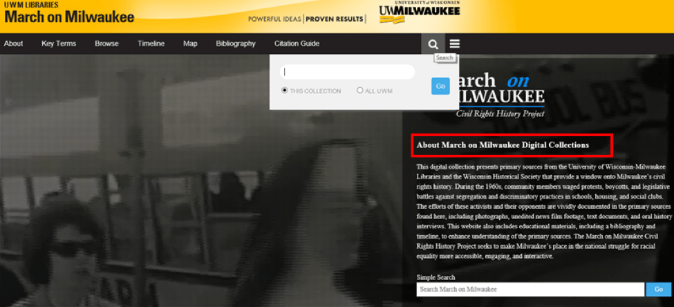
1.1/1.2/1.5. General to specific structure: Good design
HathiTrust’s structure starts from a simple and general homepage to a specific item’s content page. Also, webpages at the same level have a consistent layout.
-
- Homepages have a simple and general layout and frequently used information with the most important features (e.g., search box and Help) located at the top level.

-
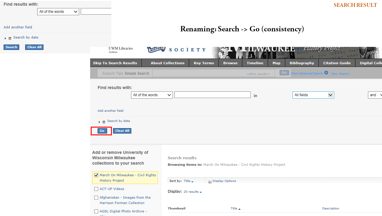
- The search results list page provides more information and additional features compared to the homepage. Important information (e.g., number of search results) is located at the beginning of the section.
-
- Content of an item provides more specific information and features. All item pages have a consistent layout.
1.3.a. Single-column layout: How-to example
Single-column layouts can be used in detail pages. Three-column layouts can be used for the homepage, landing pages, and main navigation. Fourth-column layouts can be used for the filters page and detail pages within page navigation. (European Commission, 2018).
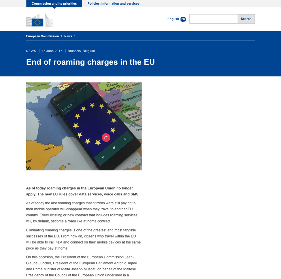
1.3.b. A linear structure in the page layout: Good design
European Commission page uses a linear structure all the time.
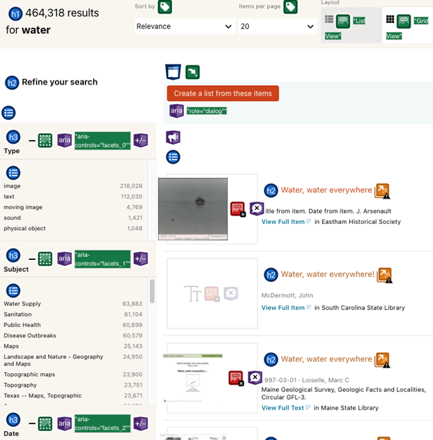
1.4/1.6. Nested Heading and facet-based browsing: Good design
DPLA uses headings for main contents such as search results (h1), search features (h3) in the filter section “refine your search” (h2), and item names (h2) in the search results list.
Also, users can narrow down search results using facet-based filters in the “Refine your search” section.
2.1. Section title: How-to example and Good design
- The following example shows that there is no section title in the right text section. BVI users might be confused about what it is and where they are now.

- Adding a section title before the content allows BVI users to immediately identify what it is.
2.2. Browse category labels with hyperlinks: How-to example and Good design
- Provide browse categories with hyperlinks to allow BVI users to explore
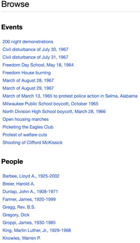
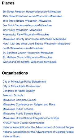
- Add a section name with a heading tag to allow BVI users to explore easily

- Use a “Search” label for the search box, and consistently use a “Go” label for facet-filters. Consistency in labeling helps users to understand the structure of a DL.
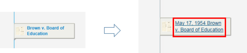
- Add Link and Date into Browse category labels so BVI users can know what it is and where it goes
3.1. Tutorial/instruction/tips: How-to example and Good design
- Brief instructions are added to explain the browse structure, and section header labels are applied so that the instructions can also be skipped by screen reader.
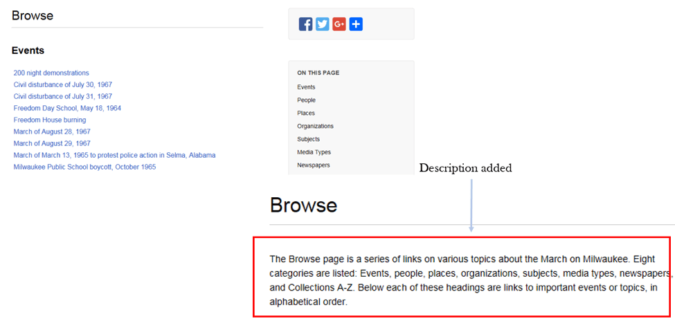
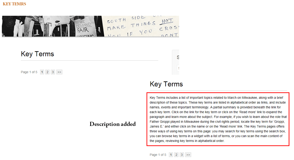
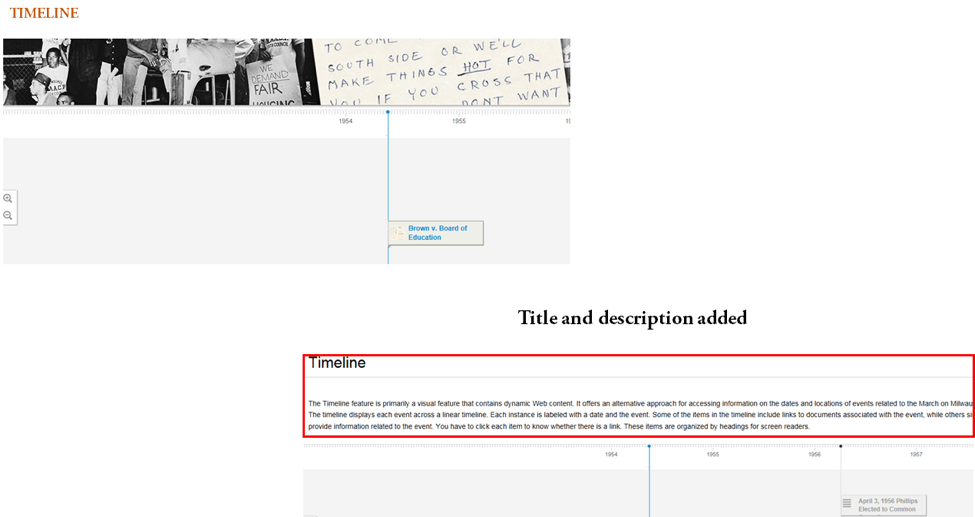
- Descriptions are added for categories (e.g., Timeline, Key terms) so that BVI users easily know what they are.
Related Resources:
-
- Xie, I., Babu, R., Joo, S., & Fuller, P. (2015). Using digital libraries non-visually: Understanding the help-seeking situations of blind users. Information Research: An International Electronic Journal, 20(2), paper 673. Retrieved from http://InformationR.net/ir/20-2/paper673.html.
- Croxford, S., & Rundle, C. (2013). Blind People and Apps on Mobile Phones and Tablets–Challenges and Possibilities. In Contemporary Ergonomics and Human Factors 2013(Vol. 343, No. 346, pp. 343-346). ROUTLEDGE in association with GSE Research.
- European Commission. (2018). Grid and page layout. Retrieved from https://ec.europa.eu/info/resources-partners/guidelines-websites-under-eceuropaeu/grid-and-page-layout_en#grid
- Jasek, C. (2004). How to design library websites to maximize usability. Elsevier: San Diego.
- Lynch, P. & Horton, S. Site Structure. Retrieved from http://webstyleguide.com/wsg3/3-information-architecture/3-site-structure.html
- W3C. (2018). WCAG 2.1 Guideline 2.4 Navigable. Retrieved from https://www.w3.org/TR/WCAG21/#navigable
- W3C. (2018). WCAG 2.1 Guideline 2.4 Navigable. Retrieved from https://www.w3.org/TR/WCAG21/#navigable
- W3C. (2018). WCAG 2.1 Guideline 3.2 Readable. Retrieved from https://www.w3.org/TR/WCAG21/#readable
- W3C. (2018). WCAG 2.1 Guideline 3.2 Predictable. Retrieved from https://www.w3.org/TR/WCAG21/#predictable
- Whitenton, K. (2013). Flat vs. Deep Website Hierarchies. https://www.nngroup.com/articles/flat-vs-deep-hierarchy/
See also:
Help-seeking Situations > F. Confusion about multiple programs, DL structures, or search results structure