Situation Definition:
A situation that arises from difficulty in accessing an
such as a link, push-button, and widget that activates with a mouse click but not with a keystroke.
Factor(s) Leading to the Situation:
-
- Inappropriate labeling:
- Inappropriate labeling:
- Inadequate features/functions:
- Inadequate support:
- Inappropriate labeling:
Guideline or Design Recommendation:
-
- Ensure labels for all clickable elements are understandable
- Ensure
can be activated using a keyboard - Provide instruction on how to access items using a keyboard
- Provide a mapping of primary DL functions and designated screen controls to corresponding screen reader commands
Rationale and Objective:
users rely on keyboard functions rather than using a visual pointing device such as a mouse. This situation involves accessing interface design elements without using a mouse or broken links. Some visual/multimedia content or application programs that include widgets only work with mouse actions (1).
features can be helpful for BVI users to recognize the changes of applications/content and access them(2). All links must be operable from a keyboard based on
requirements(3)(4). It is recommended not to use inaccessible apps, such as JavaScript frameworks.
Techniques and Methods:
- 1.1. Provide meaningful labels for all clickable elements specifying their functions
- 2.1. Use standard
controls to build - 2.2. Set up a schedule to verify, update, or remove missing or broken links
- 2.3. Provide a feedback form to enable users to report a broken link or other issues
- 3.1. Provide tips and/or instruction about how to activate elements by keyboard operations
- 4.1. Create web applications and interfaces using
so they will be compatible with screen readers
Recommended Features:
1.1 Meaningful labels (See example 1.1.a and 1.1.b)
2.1.1. Live links (See example 2.1.1)
2.1.2. Keyboard accessible active elements (See example 2.1.2.a and 2.1.2.b)
2.3. Feedback form (See example 2.3)
3.1. Help function (See example 3.1)
4.1.
-compliant interface and features (See example 4.1.a and 4.1.b)
Examples:
1.1.a. Meaningful labels: Good design
Match a label with visual function. For example, when a right arrow  is used for “Next” on a website, put the same meaning label to all right arrow visual elements such as < img src= “arrow” alt= “next”>.
1.1.b. Meaningful labels: Bad design
No meaningful label to help indicate what would happen with this feature. (There is no description or information about the connection between featured content and subject.)


2.1.1. Live Links: How-to example
Verify links and identify dead links using a tool such as WAVE software

2.1.2.a. Keyboard accessible active elements: How-to example
Add CSS “a:focus” to selectors with “a:hover” to ensure keyboard access.
2.1.2.b. Keyboard accessible active elements: How-to example
Use a simple image-based checkbox widget using tab index to allow keyboard access.
Sample code:
<!- – Without the tabindex attributes, the <span> elements would not be keyboard focusable – ->
<div>
<span role= “checkbox” aria-checked= “true” tabindex= “0”>
<img src = “checked.gif” role= “presentation” alt=”” />
Included decorative fruit basket
</span>
</div>
<div>
<span role= “checkbox” aria-checked= “true” tabindex= “0”>
<img src = “checked.gif” role= “presentation” alt=”” />
Include singing telegram
</span>
</div>
<div>
<span role= “checkbox” aria-checked= “false” tabindex= “0”>
<img src = “unchecked.gif” role= “presentation” alt=”” />
Require payment before delivery
</span>
</div>
Retrieved from https://developer.mozilla.org/en-US/docs/Web/Accessibility/Keyboard-navigable_JavaScript_widgets
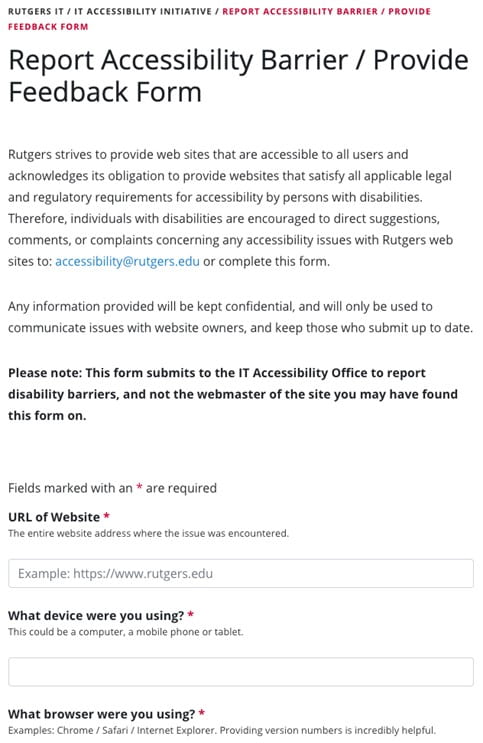
2.3. Feedback form: How-to example
Provide a feedback form in a DL (Example from Rutgers University)
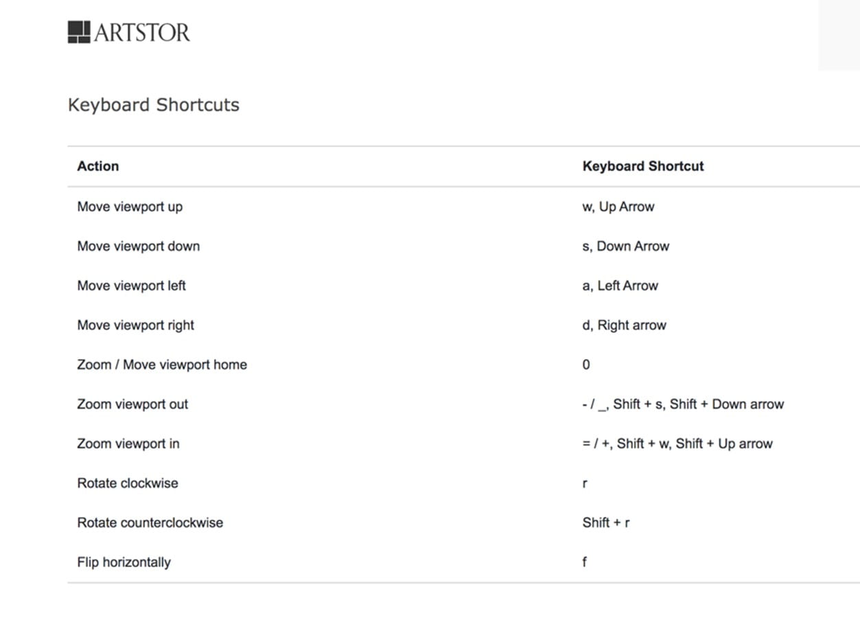
3.1. Help function: How-to example
Provide a Help function about how to activate element by keyboard operations
4.1.a. ARIA-compliant interface and features: How-to example
When a user clicks “Collection” in “Browse By”, the list of collections under “Artstor Digital Library” is generated, and the list is applied by an
compliant list and each collection heading have a label that describes the number of objects in the collection.

4.1.b. ARIA-compliant interface and features: How-to example
compliant interface (Checked by WAVE)

Related Resources:
-
- Melnyk, V., Ashok, V., Puzis, Y., Soviak, A., Borodin, Y., & Ramakrishnan, I. V. (2014, July). Widget classification with applications to web accessibility. In International Conference on Web Engineering (pp. 341-358). Cham: Springer.
- WAI-ARIA Authoring Practices 1.1 (2017) – 5.1 Fundamental Keyboard Navigation Conventions. Retrieved from http://www.w3.org/TR/wai-aria-practices/#kbd_generalnav.
- W3C. (2016). Accessible UI Components List – Frameworks, Snippets, Themes, and Widgets for a Better Web. Retrieved from https://www.w3.org/blog/wai-components-gallery/
- WCAG Understanding Guideline 2.1 Keyboard Accessible https://www.w3.org/TR/UNDERSTANDING-WCAG20/keyboard-operation.html
- Starr, J. (2016). EZID Introduces Link Checking. Retrieved from
https://www.cdlib.org/cdlinfo/2016/10/17/ezid-introduces-link-checking/
See also:
Help-seeking Situations > Difficulty Accessing Information