Situation Definition:
A situation that arises from difficulty finding or accessing a search feature in a DL, such as a search filter, search categories, search box, search suggestions, and advanced search.
Factor(s) Leading to the Situation:
-
- Complex information presentation:
- Complex information presentation:
- Complex information presentation:
- Inadequate indication:
- Inadequate indication:
- Inappropriate labeling:
- Complex information presentation:
Guideline or Design Recommendation:
-
- Offer quick and easy paths to relevant search features from prominent locations within a DL page
- Offer relevant search functions at logically appropriate locations on a DL page
- Ensure every category of search features have similar functions and appearance for large-scale DLs or integrated DLs
- Label search features and their components in a meaningful way
- Ensure search features and their components are accessible to
users
Rationale and Objective:
Multiple search features may be present on a DL web page. A search box is one of the primary elements that allow a user to find relevant information in a DL. This feature allows users to input keywords to execute a search query (1). Once search results are generated by search keywords/phrases, those results can often be filtered by additional categories and facets (2). DL search features are sometimes difficult for
users to locate. In some cases, these search features are positioned in a side widget that is not immediately available when BVI users arrow down through the main content region. Placing search features in the upper or main content region of the page rather than a side widget makes them more easily identifiable to BVI users. Furthermore, if these search features do not specify whether they are searching within the selected categories rather or the entire DL collection, this may lead to confusion for users. Although
are a popular feature, some BVI users might not understand that the auto-suggestions exist (3). An advanced search feature may often be used by more experienced users. The advanced search feature should be placed near the simple search box or be available via a link following the simple search.
Techniques and Methods:
1.1. Provide skip-to-links to a variety of search features within a DL
2.1. Place search features or skip-to-links in the top navigation region of a page (See example 2.1)
3.1. Specify the range of the search (entire site, within a collection, within results, etc.) for every search feature through relevant labels
4.1. Place a Submit button after all other search features/filters
4.2. Add a meaningful label for each component of each feature
5.1. Use
elements to make search components easily recognized and accessible (3)
5.2. Add accessible headings before the search features
Recommended Features:
1.1. Skip-to-search feature link (See example 1.1)
3.1. Search feature with range (See example 3.1)
4.2. Meaningful labels (See examples 4.2.a/5.2.a, 4.2.b, and 4.2.c)
5.1.
elements (See example 5.1)
5.2. Accessible headings (See example 4.2.a/5.2.a)
Examples:
1.1. Skip-to-search feature link: Good design
-
- Skip to the collection type in advanced search (Artstor)

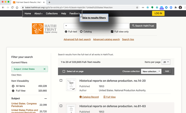
- Skip to results filters (HathiTrust)
2.1. Place search box feature in the top navigation region of the page: How-to example
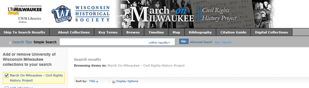
- Simple search box added to the main page of the collection.

- Position advanced search following simple search – CONTENTdm
3.1. Search feature with range: How-to example
-
- Label Simple Search to differentiate from other types of search features, such as Advanced Search, and Global Search.

-
- Add instructions as the label for the search box

-
- Add search tips

4.2.a/5.2.a. Coding example of adding meaningful label with accessible heading: How-to example
<label class= “search-label” for= “search”>Search about March on Milwaukee:</label><input type= “text” name= “search” id= “search”><input type= “text” name= “search”
4.2.b. Meaningful label: How-to example
Apply labels to unlabeled edit field -> label (Simple Search Edit Search March on Milwaukee)

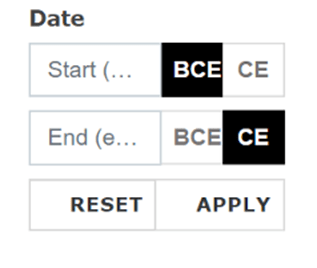
4.2.c. Meaningful label: Bad design
Using uncommon language such as jargon in a particular profession
E.g., Using BCE/CE instead of BC/AD
5.1.a. ARIA elements: How-to example
ARIA – combobox, listbox, and announce elements (Cifcioglu, 2017)
<div id= “searchfield”>
<form>
<label for= “search”>Suburb or Town Search</label>
<input id= “search” type=”text” class= “biginput”
autocomplete= “off” role= “combobox”
aria-autocomplete= “both” aria-owns= “results”
aria-activedescendant= “suggestion-1” />
</form>
</div>
<div class= “autocomplete-suggestions”
id= “search-autocomplete”>
<div id= “results” role= “listbox”>
<div class= “autocomplete-suggestion” id= “suggestion-1”
role= “option”>Melton</div>
</div>
</div>
-
- Accessible heading ARIA example in combobox
role= “combobox” in the <input> field (inform to screen reader users): the input field is an auto-suggest;
-
- aria-autocomplete=”both” in the <input> field: screen reader users can select from the suggestion list or type their own input;
- aria-owns to the <input> field links the suggestion list to the input field;
- role=“listbox“ in the suggestion list <div> contains a list of selectable items; or aria-live regions: 1) Polite = the screen reader will finish what it’s saying before announcing the live region content 2) Assertive = the screen reader will interrupt what it’s saying to announce the live region content 3) Off = the screen reader won’t announce the content unless the user focuses on that region
- ARIA editable auto-complete dropdown (https://www.w3.org/TR/wai-aria-practices/examples/combobox/aria1.1pattern/listbox-combo.html)
Related Resources:
-
- Babich, N. (2017). Design a Perfect Search Box. https://uxplanet.org/design-a-perfect-search-box-b6baaf9599c
- Bustos, L. (2017). 11 Tips for Advanced Search Usability. Retrieved from https://www.getelastic.com/advanced-search-usability
- Cifcioglu, A. (2017). Anatomy of an Accessible Auto Suggest. Retrieved from https://uxmastery.com/anatomy-of-an-accessible-auto-suggest/
- Bohman, P. (2013). HTML 5 Accessibility. Retrieved from https://dequeuniversity.com/assets/html/jquery-summit/html5/slides/landmarks.html
- Library of Congress. (2018). Search help. Retrieved from https://www.loc.gov/search/help/
- W3C. (2018). WCAG 2.1 Guideline 2.4 Navigable. Retrieved from https://www.w3.org/TR/WCAG21/#navigable
- W3C. (2018). WCAG 2.1 Guideline 3.2 Predictable. Retrieved from https://www.w3.org/TR/WCAG21/#predictable
- W3C. (2017). WAI-ARIA Authoring Practices 1.1. Retrieved from https://www.w3.org/TR/wai-aria-practices/
See also:
Help-seeking Situations > A. Difficulty Accessing Information
Help-seeking Situations > D. Difficulty locating specific information, items, or features
Help-seeking Situations > Difficulty constructing or refining searches > H3. Difficulty tracking searches