Situation Definition:
A situation that arises from difficulty identifying the current location, monitoring the path to which a user moved, and returning to a previous location within a DL.
Factor(s) Leading to the Situation:
-
- Complex information presentation: illogical structure (text with tooltip) A DL does not present the organization of page elements in a rational way within or across DL page(s).
- Complex information presentation: illogical organization of information (text with tooltip) A DL does not present information topics in a rational way.
- Inadequate help information: navigation aids (text with tooltip) Features or information regarding the search path are either missing or insufficient.
- Inadequate support: contextual cues (text with tooltip) Content surrounding an inaccessible or incomprehensible item does not assist a user in understanding what this item entails.
- Inadequate support: previously visited page (text with tooltip) Lack of features to support BVI users go back to previously visited pages
- Inappropriate labeling: features (text with tooltip) Existing label of a feature does not clarify its purpose/function or how to interact with it.
Guideline or Design Recommendation:
-
- Maintain hierarchical navigation structures consistently across DL pages
- Articulate the current location and paths throughout a DL
- Title each DL page, each section of a page, and landmarks in a meaningful way
- Allow a user to return to a previously visited location in a DL
- Label all navigation elements in a meaningful way
Rationale and Objective:
To effectively navigate a DL, users must be able to answer the question “Where am I?” Knowing the current location and other possible navigation paths is critical in information retrieval, and failing to recognize the current location is a common problem in DL navigation for BVI users (1). Users should be informed about their current location within a set of related pages. For users of screen readers (text with tooltip) A software program that reads textual information through synthesized speech, and it offers specialized keyboard commands to operate a computer interface , a navigation landmark is a quick way to jump to the navigation. A sitemap (text with tooltip) It is a webpage where a digital library provides information about the list of websites in the digital library. showing 1) the location of the current page in the DL; 2) the structure of the website (how the pages interconnect;) and 3) the path of the navigation, may be helpful (2). The use of breadcrumbs (text with tooltip) It is a text path of the current page or content that usually located at the top of a page for providing where a user is on the digital library. and/or sitemaps may improve navigability and reduce the number of required actions by indicating higher/lower-level pages and the relationship between web pages, as well as the location of the user within the DL’s hierarchy (3). Breadcrumbs can also show the history of how a user interacted with the DL web page.
Techniques and Methods:
1.1. Use consistent navigation aids (e.g., navigation menu,
sitemap
(text with tooltip)
It is a webpage where a digital library provides information about the list of websites in the digital library.
, and tabs) on all pages of a DL
1.2. Design navigation aids, such as menu bars and sitemaps, with a hierarchical structure
2.1. Add location indicators such as
breadcrumbs
(text with tooltip)
It is a text path of the current page or content that usually located at the top of a page for providing where a user is on the digital library.
on each page
2.2. Provide an accessible sitemap tab on every page, describing the current location within a DL structure
2.3. Create URLs to match item titles
3.1/5.1. Provide meaningful labels for page titles, section titles, and landmark titles
4.1. Use the HTML 5 history API to generate a list of visited pages
Recommended Features:
1.1. Consistent navigation aids (See example 1.1)
1.2.a. Menu bar (See example 1.2.a)
1.2.b/2.2. Accessible
sitemap
(text with tooltip)
It is a webpage where a digital library provides information about the list of websites in the digital library.
(See example 1.2.b/2.2)
2.1.
Breadcrumbs
(text with tooltip)
It is a text path of the current page or content that usually located at the top of a page for providing where a user is on the digital library.
(See examples 2.1.a and 2.1.b)
2.3. Descriptive URLs (See example 2.3)
3.1/5.1. Page titles, section titles and landmark titles (See examples 3.1.a/5.1.a, 3.1.b/5.1.b, and 3.1.c/5.1.c)
4.1.a. HTML5 History API (e.g., pushState) (See example 4.1.a)
4.1.b. Visited page links (See example 4.1.b)
Examples:
1.1. Consistent navigation aids: Good design
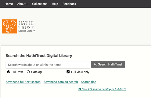
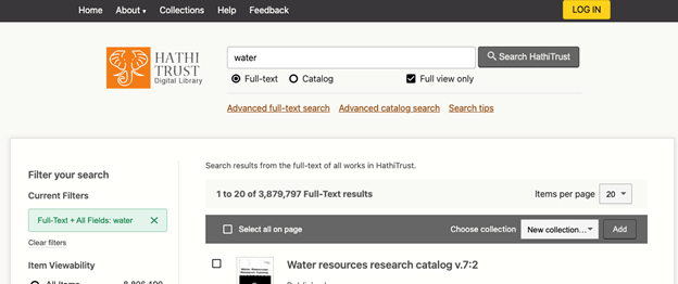
HathiTrust keeps consistent navigation aids. The top menu remains in the same position across all pages. Also, the location of the search box for BVI users is consistent for all pages.
Homepage of HathiTrust
Search result page
Item level
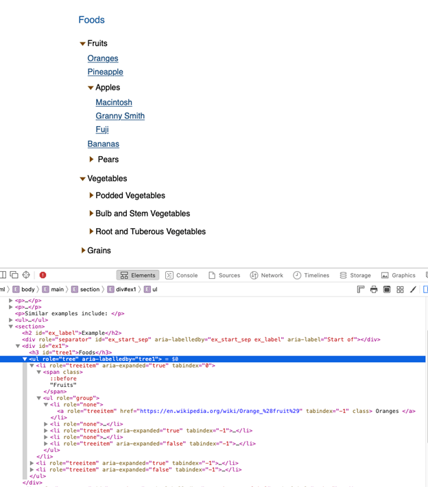
1.2.a. Creating menu bar with a hierarchical structure and accessibility: How-to example
Navigation treeview example using computed Properties – Keyboard support from https://www.w3.org/TR/wai-aria-practices/examples/treeview/treeview-2/treeview-2a.html
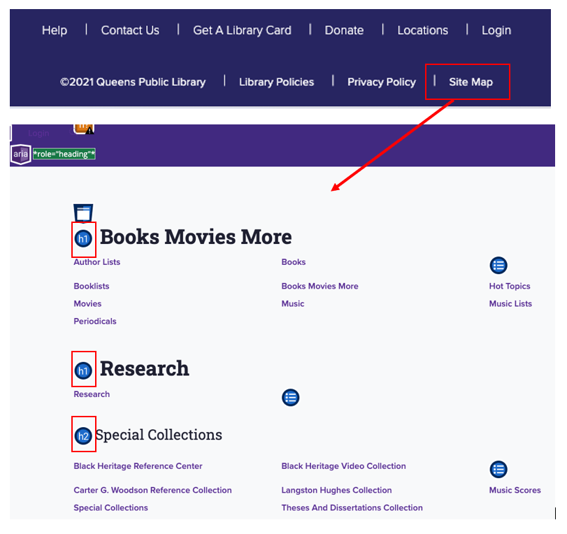
1.2.b/2.2. Accessible sitemap: How-to example and Good design
Locate sitemap at the end of the footer so that users always know the sitemap is the last of the page and also, they can use it as a navigational jump function to their desired page. For example, Queens Public Library puts a sitemap at the footer’s end, and the sitemap is accessible.
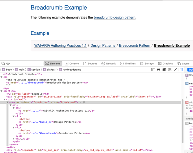
2.1.a. Breadcrumb: How-to example
WAI-ARIA breadcrumb example from https://www.w3.org/TR/wai-aria-practices/examples/breadcrumb/index.html
<nav aria-label= “Breadcrumb” class= “breadcrumb”>
2.1.b. Breadcrumb: Good design
Breadcrumbs with Home link in the navigation bar (Europeana, the EU digital platform for cultural heritage, 2018)
Search result link in the breadcrumb (trail)
2.3. Clear URL path structure: How-to example
e.g., /item?sessionid=9871209387498&token=918123… (Users can not know where they are and what the actual web address is.)
Change to /collection/248/item/31 (Informs users know where they are and what it is.)
3.1.a/5.1.b. Section title: How-to example
More elaborations added for JAWS screen reader: renaming the link for search results, descriptions added for navigation marks – “Previous/Next Search Result” (invisible, but readable by JAWS)
e.g., <span class= “secondary_button_icon icon_arrow_w”>Previous Search Result</span>
3.1.b/5.1.b. Clear labeling for navigation indicators: How-to example and Good design
Add more text information in the label of navigation indicators
3.1.c/5.1.c Clear labeling: How-to example and Good design
Rename “Digital Collection” to “March on Milwaukee Digital Collection” (Add more specific description)
4.1.a. HTML 5 History API: How-to example
Apply JavaScript HTML5 History APIs, such as history.pushState(), history.back/forward(), and history.go(index), which can be used to move forward and backward or move to a specific page visited
4.1.b. Visited page links: How-to example
Avoid ‘target= “blank”’ for links because this can break browser navigation
Related Resources:
-
- Xie, I., Babu, R., Joo, S., & Fuller, P. (2015). Using digital libraries non-visually: Understanding the help-seeking situations of blind users. Information Research: An International Electronic Journal, 20(2), paper 673. Retrieved from http://InformationR.net/ir/20-2/paper673.html.
- W3C. Providing a site map. Retrieved from https://www.w3.org/WAI/WCAG21/Techniques/general/G63.html
- Gube, J. (2009). Breadcrumbs In Web Design: Examples And Best Practices. Retrieved from https://www.smashingmagazine.com/2009/03/breadcrumbs-in-web-design-examples-and-best-practices/
- Europeana. (2018). Exhibitions. Retrieved from https://www.europeana.eu/portal/en/exhibitions
- Façanha, A. R., Viana, W., Pequeno, M. C., de Borba Campos, M., & Sánchez, J. (2014, June). Touchscreen mobile phones virtual keyboarding for people with visual disabilities. In International Conference on Human-Computer Interaction(pp. 134-145). Springer, Cham.
- Holst, C. (2014). 4 Design Patterns That Violate Back-Button, Expectations. Retrieved from https://baymard.com/blog/back-button-expectations
- Markus, N., Malik, S., Juhasz, Z., & Arató, A. (2012, July). Accessibility for the blind on an open-source mobile platform. In International Conference on Computers for Handicapped Persons (pp. 599-606). Springer, Berlin, Heidelberg.
- MotoCMS. (2014). Breadcrumb Navigation Explained: Types, Benefits, Guidelines. Retrieved from https://www.motocms.com/blog/en/breadcrumb-navigation/
- Open Library. (2018). Retrieved from https://openlibrary.org/
- Sutton, J. (2002). A Guide to Making Documents Accessible to People who are Blind or Visually Impaired. American Council of the Blind, Washington, DC.
- Theng, Y. L., Duncker, E., Mohd-Nasir, N., Buchanan, G., & Thimbleby, H. (1999, September). Design guidelines and user-centred digital libraries. In International Conference on Theory and Practice of Digital Libraries (pp. 167-183). Springer, Berlin, Heidelberg.
- W3C. (2018). WCAG 2.1 Guideline 2.4 Navigable. Retrieved from https://www.w3.org/TR/WCAG21/#navigable
- W3C. (2018). WCAG 2.1 Guideline 2.4.8 Location. Retrieved from https://www.w3.org/WAI/WCAG21/Understanding/location.html
- W3C. (2018). WCAG 2.1 Guideline 2.4.2 Page Titled. Retrieved from https://www.w3.org/WAI/WCAG21/Understanding/page-titled.html
- W3C. (2018). WCAG 2.1 3.2.3 Consistent Navigation. Retrieved from https://www.w3.org/TR/WCAG21/%23consistent-navigation%20#consistent-navigation
- W3C. (2018). WCAG 2.1 2.1.1 Keyboard. Retrieved from https://www.w3.org/TR/WCAG21/#keyboard
- W3C. (2018). WCAG 2.1 2.4.3 Focus Order. Retrieved from https://www.w3.org/TR/WCAG21/#focus-order
- W3C. (2018). WCAG 2.1 Guideline 3.2 Predictable. Retrieved from https://www.w3.org/TR/WCAG21/%23consistent-navigation#predictable
See Also:
Help-seeking Situations > E. Difficulty identifying current status, path, or cursor mode

