Situation Definition:
A situation that arises from difficulty figuring out how to use a DL, specifically difficulty getting started in a DL or determining how to best approach the DL. This situation typically occurs at the start of using a DL.
Factor(s) Leading to the Situation:
-
- Complex information presentation: illogical structure (text with tooltip) A DL does not present the organization of page elements in a rational way within or across DL page(s).
- Complex information presentation: illogical organization of information (text with tooltip) A DL does not present information topics in a rational way.
- Inadequate knowledge: DL (text with tooltip) Users do not have enough information or experience related to the digital library being used.
- Inappropriate labeling: active elements (text with tooltip) Existing label of an active element does not clarify its purpose/function or how to interact with it.
- Inappropriate labeling: applications (text with tooltip) Existing label of an application does not clarify its purpose/ function or how to interact with it.
- Inappropriate labeling: features (text with tooltip) Existing label of a feature does not clarify its purpose/function or how to interact with it.
- Unclear instruction: DL features (text with tooltip) DL does not explain what a specific feature is and/or how to use it.
Guideline or Design Recommendation:
-
- Clearly convey the purpose, functions, structure, and coverage of a DL
- Provide instruction to explain how to use a DL
- Clearly convey the purpose of each section of a DL
- Clearly convey the availability of DL features and their functions
- Ensure DL feedback is accessible
Rationale and Objective:
DLs should include descriptions explaining the purpose of the DL and instructions on how to effectively use the site. These introductory descriptions should be available in a textual format for BVI (text with tooltip) The acronym for Blind and Visually Impaired, and it refers to BVI users who rely on screen readers to understand DL content. users and accessible through a link or menu. Overall features should be navigable, operable, and usable with a screen reader (1) (2) (3). Using ARIA (text with tooltip) The acronym for Accessible Rich Internet Applications. It is a set of attributes that define ways to make web content and web applications more accessible to people with disabilities. features allows a screen reader to access information more easily (4). Designing a logical web page layout should reduce a BVI user’s need to visit instructions (4). DLs that offer complex presentation of information or excessive functions, such as a navigation bar with several links, increase a BVI user’s load as the user attempts to get oriented on how to use the DL, making it difficult for the user to get started. Unclear labels make users question the purpose of the DL. Clear descriptions in understandable language are necessary for BVI users to understand how to begin using a DL, which may be a new and unfamiliar system. When a user is not clear on how to use the system, tips should be provided to orient the user. Providing additional information for this orientation, such as what the next step is to use the system, or explaining the purpose of the system, helps users to recognize the utility of the DL. These instructions should be provided on a Help page.
Techniques and Methods:
1.1. Provide the purpose, function, structure, and coverage of a DL as part of “About this DL” (or similar label) as one of the menu items
2.1. Provide a specific help page including instructions on how to use the DL, accessibility instructions for screen reader users, and contact information for tech support
2.2. Provide easy access to help and FAQ pages, such as “Help” on the main menu, on a navigation bar, and via inline help
3.1/4.1. Provide meaningful
labels
(text with tooltip)
A classifying phrase or name applied to elements and functions; a tag in HTML that denotes a specific portion of code
for section headings, features, page titles, links, menus, tabs, forms, etc.
4.2. Provide
context-sensitive help
(text with tooltip)
A help function that delivers immediate assistance to the user without the user having to leave the current context they are working in
tips for DL features
5.1. Provide text or sound alerts to convey feedback
Recommended Features:
1.1. Menu items (e.g., About this DL, Overview) (See examples 1.1.a and 1.1.b/2.1)
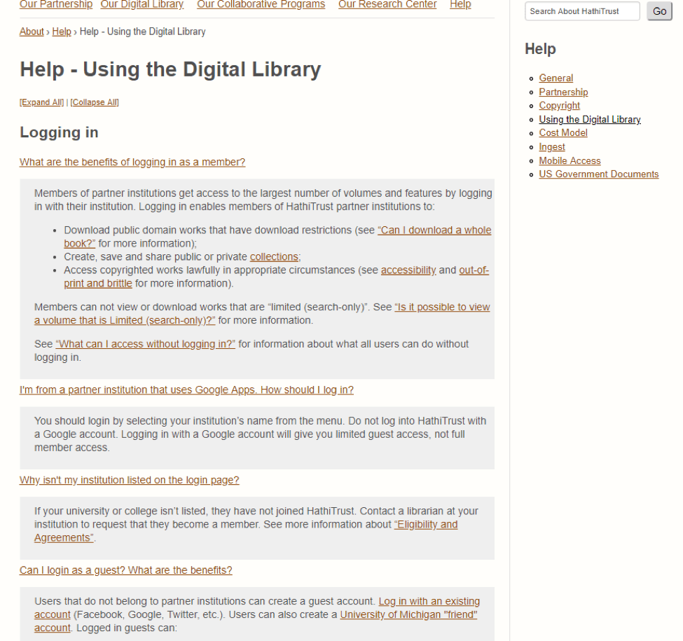
2.1. Help page with tutorials (See example 1.1.b/2.1)
2.2.a. List of shortcuts for screen readers users (See example 2.2.a)
2.2.b. Help and FAQ (See example 2.2.b)
3.1/4.1. Meaningful labels (See example 3.1/4.1)
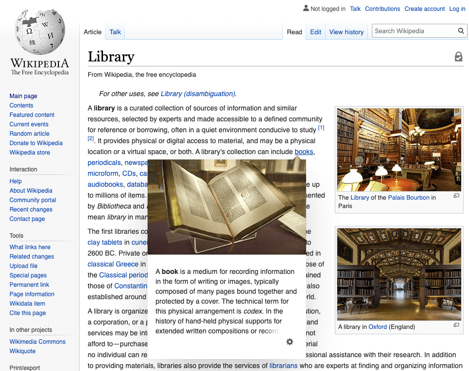
4.2. Contextual help tips including help tips and inline help (See example 4.2)
5.1. Text or sound alerts (See example 5.1)
Examples:
1.1.a. Menu items: Good design
Provide text description about a collection (Library of Congress)
1.1.b/2.1. Help page with instructions: Good design
Provide a specific Help page by categorized topics (HathiTrust)
2.2.a. Provide easy access to the Help page: Good design
Provide a list of shortcut links for all users: Screen readers users can find those links easily in the Link list of their screen reader software.
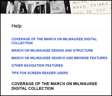
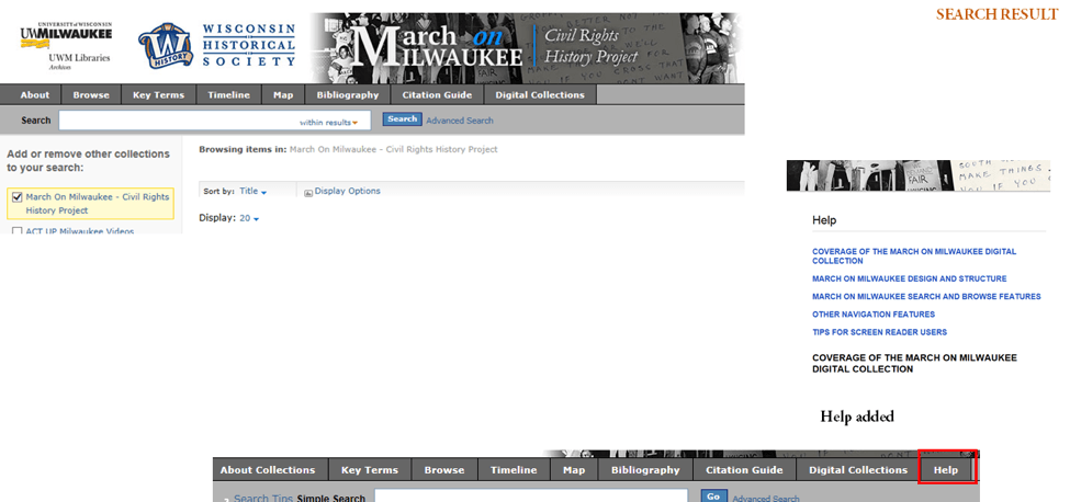
2.2.b. Link to the Help page: Good design
Prominent link to explicit help (e.g., “Help”) in the top menu navigation bar: A screen reader user can find the help page easily
3.1/4.1. Meaningful label: Good design
Clear labels referencing the DL collection
4.2. Contextual help tips: Good design
Inline help can provide immediate support and help to all users (e.g., Wikipedia).
5.1. Text or sound alerts: How-to example
Add ARIA-alert role to notify of the alert
<h2 role= “alert”> You did not put your address </h2>
You can find more information from w3c.org and Mozilla.org.
<button id= “alert-trigger”>
Trigger Alert
</button>
<div id= “example” role= “alert”></div>
<!– The following script element contains the content that will be inserted into the alert element. –>
<script type= “text/template” id= “alert-template”>
<p><span lang= “da”>Hej</span>, hello, <span lang= “it”>ciao</span>, <span lang= “ja”>こんにちは</span>, <span lang= “ko”>안녕</span></p>
</script>
Related Resources:
-
- W3C. (2018). WCAG 2.1 Guideline 2.4 Navigable. Retrieved from https://www.w3.org/TR/WCAG21/#navigable
- W3C. (2018). WCAG 2.1 Guideline 3.1 Readable. Retrieved from https://www.w3.org/TR/WCAG21/#readable
- W3C. (2018). WCAG 2.1 Guideline 3.2 Predictable. Retrieved from https://www.w3.org/TR/WCAG21/#predictable
- UC Berkley. (2018). Top 10 Tips for Making Your Website Accessible. Retrieved from https://webaccess.berkeley.edu/resources/tips/web-accessibility
- HathiTrust. (2018). Help –Using the Digital Library. Retrieved from https://www.hathitrust.org/help_digital_library#SearchTips
- Patterson, M. (2017). 8 Best Practices for Designing a Helpful Contact Page. Retrieved from https://www.helpscout.net/helpu/contact-us-page-design/
See also:
Help-seeking Situations > C. Difficulty with help


