Situation Definition:
A situation that arises from difficulty understanding the meaning of labels (text with tooltip) A classifying phrase or name applied to elements and functions; a tag in HTML that denotes a specific portion of code associated with various features, elements, or objects within the DL.
Factor(s) Leading to the Situation:
-
- Inadequate knowledge: information retrieval (text with tooltip) Users lack the necessary know-how regarding how to search for information.
- Inappropriate labeling: active elements (text with tooltip) Existing label of an active element does not clarify its purpose/function or how to interact with it.
- Inappropriate labeling: applications (text with tooltip) Existing label of an application does not clarify its purpose/ function or how to interact with it.
- Inappropriate labeling: features (text with tooltip) Existing label of a feature does not clarify its purpose/function or how to interact with it.
- Inappropriate labeling: file formats (text with tooltip) Existing label of a file format does not correctly indicate the format of an item.
- Inappropriate labeling: metadata (text with tooltip) Existing label of metadata does not follow the DCMI rule.
Guideline or Design Recommendation:
-
- Label features and elements in the DL to indicate their functions
- Label the items in the DL to indicate the nature of documents
- Ensure the clarity of the purpose, function, and outcome of using features and elements
- Offer assistance in interpreting the meaning of labels (text with tooltip) A classifying phrase or name applied to elements and functions; a tag in HTML that denotes a specific portion of code whenever necessary
Rationale and Objective:
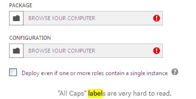
Labeling is critical in designing a DL webpage for BVI users (1). The function of labels varies depending on their role on the web page. Because DLs include a range of terminology related to the system, subject/topic areas, metadata, (text with tooltip) Commonly called ‘data about data,’ it includes structured data to describe and organize resources in the digital environment and enables users to discover and use the content of digital libraries. etc., it is important to provide clear labels that plainly designate the purpose of the label. Labeling for navigation, such as links, should be focused on “where to go,” while labeling for identification of contents should describe “what it is” by using titles, (sub)headings, taglines, or image and video captions (2). For items denoting additional information, labeling should explain the relationship between items. For words with all upper-case characters, some screen readers’ default setting is to read upper-case text letter-by-letter, thereby reducing readability for BVI users.
Techniques and Methods:
1.1. Describe “what” and “how” for the
label
(text with tooltip)
A classifying phrase or name applied to elements and functions; a tag in HTML that denotes a specific portion of code
of features and elements
1.2. Label links consistently with the title of the destination page
2.1. Describe “what it is” for the label of an object
3.1. Use common terms instead of jargon whenever possible
3.2. Avoid using all upper-case characters in labeling
3.3. Add supplementary text to describe the purpose, function, and outcome of features and elements if needed
4.1. Provide a glossary for the labels used in a DL
4.2. Provide
context-sensitive help
(text with tooltip)
A help function that delivers immediate assistance to the user without the user having to leave the current context they are working in
tips to present the glossary term for a label
Recommended Features:
1.1. “What,” “how”, or “where” descriptions of a feature or element label (See example 1.1)
2.1. “What it is” description of an item label (See example 2.1)
3.1. Common terminologies (See example 3.1)
3.2. Mixed-case labels (See example 3.2)
3.3. Supplementary text (See example 3.3)
4.1. Glossary (See example 4.1)
4.2. Context-sensitive help tips (See example 4.2)
Examples:
1.1. “What”, “how”, or “where” descriptions of a feature or element label: Good design
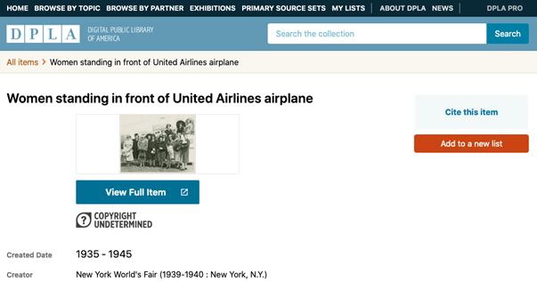
Intuitive labeling to features (Cite this item, Add to a new list, View Full Item)
2.1. “What it is” description of an item label: Bad design
Insufficient information is provided for the user to understand what the item is.
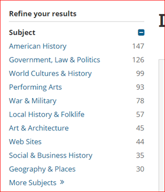
3.1. Common terminologies: Good design
Library of Congress uses common language that everyone can understand.
3.2. Do not label with all capitals: Bad design
(Source: Babich, 2016)
3.3. Supplementary text: How to example
Add supplementary text for describing “Browse”
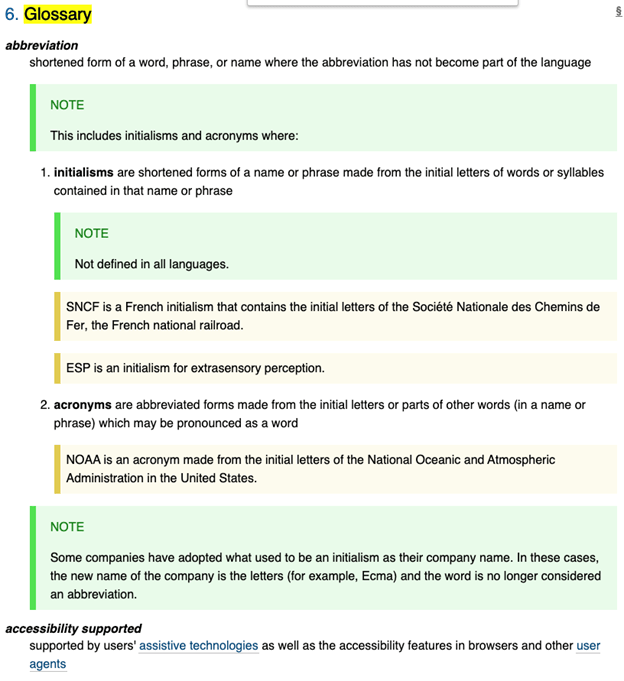
4.1. Glossary: Good design
WCAG 2.1 provides a glossary.
4.2. Context-sensitive help tips: Good design
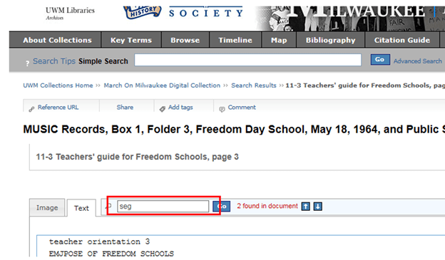
Instruction added in the box label as help tips: “Enter a term to search the transcript and hit enter. Then find the term in the transcript by using the H key to navigate directly to the term.”
Related Resources:
-
- Babich, N. (2016). Designing More Efficient Forms: Structure, Inputs, Labels and Actions. Retrieved from https://uxplanet.org/designing-more-efficient-forms-structure-inputs-labels-and-actions-e3a47007114f
- Thurow, S. (2015). How To Create A Website’s Nomenclature (Or Labeling System) For Online Findability. Retrieved from https://marketingland.com/create-websites-nomenclature-labeling-system-online-findability-131130
- Cutts, M. (2005). Gadgets, Google, and SEO. Retrieved from https://www.mattcutts.com/blog/dashes-vs-underscores/
- WCAG 2.0 Guideline 3.1 Readable. (2008). Retrieved from https://www.w3.org/TR/WCAG20/#meaning
- WebAIM. (2020). Decoding Label and Name for Accessibility. Retrieved from https://webaim.org/articles/label-name/
- WebAIM. (2020). Associate Form Labels with Controls. Creating Accessible Forms. Retrieved from https://webaim.org/techniques/forms/#labels
See also:
Help-seeking Situations > C. Difficulty with help

