Situation Definition:
A situation that arises when a user cannot find relevant help information; when the available help information is not easy to understand; or when the available help information is not useful for the task at hand.
Factor(s) Leading to the Situation:
- Complex information presentation: excessive information or features (text with tooltip) A DL presents too much information at once.
- Complex information presentation: illogical structure (text with tooltip) A DL does not present the organization of page elements in a rational way within or across DL page(s).
- Complex information presentation: illogical organization of information (text with tooltip) A DL does not present information topics in a rational way.
- Inadequate help information: overall (text with tooltip) Existing help resources do not assist users in identifying relevant help topics.
- Inadequate knowledge: DL (text with tooltip) Users do not have enough experience and information related to the digital library being used.
- Inadequate knowledge: domain knowledge (text with tooltip) Users do not have familiarity or background knowledge regarding a given search topic.
- Unclear instruction: help feature (text with tooltip) DL does not explain how to locate and/or use needed help information.
Guideline or Design Recommendation:
-
- Offer help information relevant to all tasks supported by a DL
- Assist users in finding relevant help information
- Ensure help information is understandable to users of all ability levels
- Explain how to perform various functions of a DL in a meaningful way
Rationale and Objective:
Users accessing DL help information are usually those who are seeking additional information about or instructions on how to use DL features. For BVI (text with tooltip) The acronym for Blind and Visually Impaired, and it refers to BVI users who rely on screen readers to understand DL content. users, help should be presented in clear language in textual form. Explanations should use common words rather than jargon, as concise as possible, providing an accurate explanation of the purpose and offerings of the DL. When users need more information about something they don’t understand, it is helpful to provide links to related information. Maintaining consistent structure across help pages helps users to better understand help information on various help pages.
Techniques and Methods:
1.1. Set up a schedule to review and update help pages
1.2. Map each help section to each of the tasks supported by a DL
2.1. Include links to
context-sensitive help
(text with tooltip)
A help function that delivers immediate assistance to the user without the user having to leave the current context they are working in
within general help
2.2. Provide an overview of the help topics
2.3. Provide a link for general help at the top of every DL page.
2.4. Divide help information into short sections and subsections, using heading tags such as <H2> and <H4>
2.5. Provide real-time human assistance such as an online chatting
2.6/3.1. Organize various sections of the help page in a consistent structure and format
3.2. Use simple language with common terms rather than jargon or professional language
3.3. Use sight-independent instructions or provide alt text or descriptions for visual instruction to present help information
4.1. Provide step-by-step directions with examples in completing specific tasks in context-sensitive help or solving common problems (e.g., FAQ)
4.2. Include specific help tips for screen reader users
Recommended Features:
1.2. Comprehensive help coverage (See example 1.2/2.2)
2.1.
Context-sensitive help
(text with tooltip)
A help function that delivers immediate assistance to the user without the user having to leave the current context they are working in
(See example 2.1.a/2.1.b)
2.1. Links to context-sensitive help (See example 2.1.a/2.1.b)
2.2. Help overview (See example 1.2/2.2)
2.3. Prominent help link (See example 2.3)
2.4. Heading tags (See examples 2.4.a and 2.4.b)
2.5. Online chatting (See example 2.5)
2.6/3.1. Consistent structure and format (See example 2.6/3.1)
3.2. Simple language (See example 3.2/4.1.a)
3.3. Nonvisual instruction or alt text/description (See example 3.3)
4.1.a. A Step by step instruction (See example 3.2/4.1.a/4.1.b)
4.1.b. Examples (See example 3.2/4.1.a/4.1.b)
4.2. Screen reader tips (See example 4.2)
Examples:
1.2/2.2. Comprehensive help coverage and providing help overview: Good design
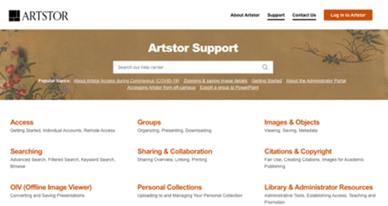
Help articles are laid out into sections, and give an outline is provided. The quantity and type of help are appropriate to the user (Artstor).
2.1.a/2.1.b. Context-sensitive help and link: Good design
In the general “Help” page, context-sensitive help is provided and also indicated by hyperlink.
2.3. Prominent help link: Good design
Help link prominently located at the top of the page in the header navigation so users can always find and access the “Help” page at the same location.
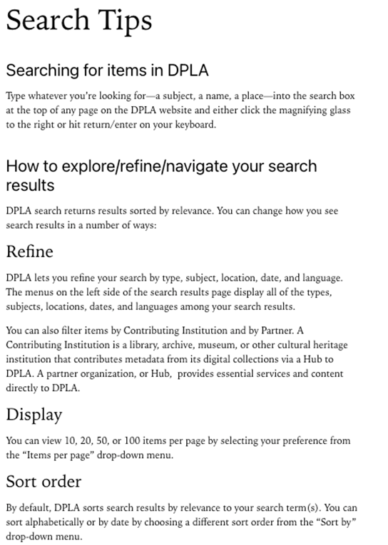
2.4.a. Heading tag: Good design
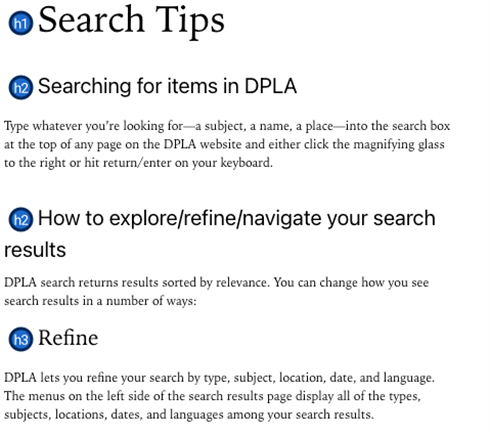
Search Tips in DPLA use heading tags to divide help information into short sections and subsections.
2.4.b. Heading tag: Bad design
Sub-sections are divided by special characters, and no heading tag is applied.
2.5. Online chatting: Good design
Queens Public Library provides a synchronous online chat to help users.
2.6/3.1. Consistent structure and format: Good design
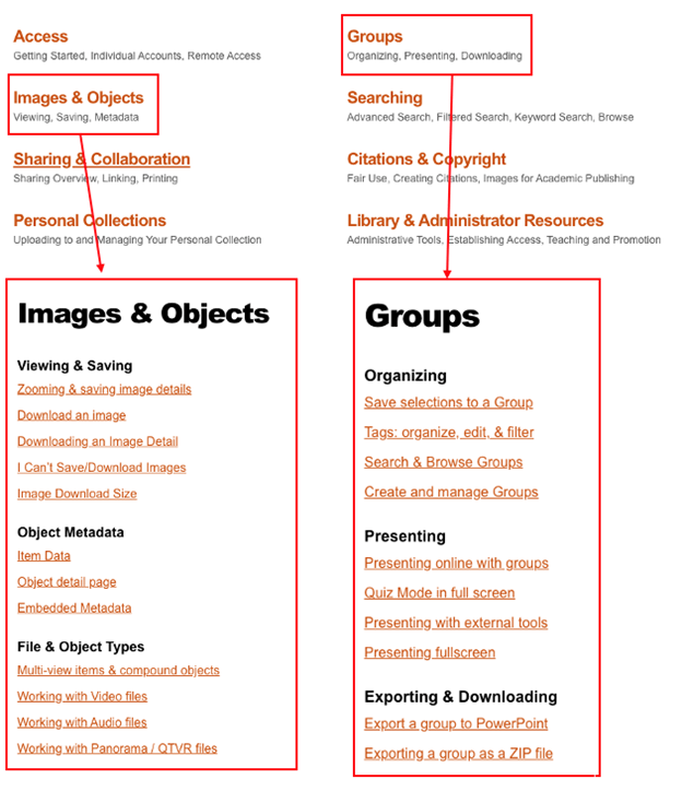
Artstor has a consistent design in every section of the Help page.
3.2/4.1.a/4.1.b. Step-by-step instruction with simple language and examples: Good design
Search Tips in DPLA uses simple language and provide step-by-step instruction for how to search and narrow down search results.
3.3. Nonvisual instruction or alt text/description: Good design
The following search help uses textual examples rather than visual examples so that BVI users can easily read it using their screen reader software.
4.2. Screen reader tips: Good design
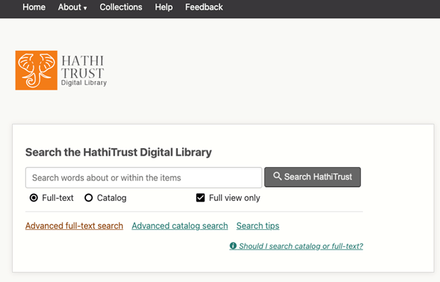
HathiTrust provides screen reader tips and their coverage of current accessibility.
Related Resources:
-
- Snell, S. (2009). Clear and Effective Communication in Web Design. Retrieved from https://www.smashingmagazine.com/2009/02/clear-and-effective-communication-in-web-design/
- W3C. (2018). WCAG 2.1 Guideline 3.1 Readable. Retrieved from https://www.w3.org/TR/WCAG21/#readable
See also:
Help-seeking Situations > C. Difficulty with help
Help-seeking Situations > D. Difficulty locating specific information, items, or features

