Situation Definition:
A situation that arises from difficulty understanding the overall structure or layout of the search results displayed by a DL.
Factor(s) Leading to the Situation:
-
- Complex information presentation: excessive information or features (text with tooltip) A DL presents too much information at once.
- Complex information presentation: illogical structure (text with tooltip) A DL does not present the organization of page elements in a rational way within or across DL page(s).
- Complex information presentation: illogical organization of information (text with tooltip) A DL does not present information topics in a rational way.
- Inadequate knowledge: DL (text with tooltip) Users do not have enough experience and information related to the digital library being used.
- Inadequate support: contextual cues (text with tooltip) Content surrounding an inaccessible or incomprehensible item does not assist a user in understanding what this item entails.
- Inappropriate labeling: applications (text with tooltip) Existing label of an application does not clarify its purpose/ function or how to interact with it.
- Inappropriate labeling: features (text with tooltip) Existing label of a feature does not clarify its purpose/function or how to interact with it.
Guideline or Design Recommendation:
-
- Maintain a simple and consistent logical structure and layout for presenting search results in a DL
- Ensure that structural elements of search results have meaningful labels (text with tooltip) A classifying phrase or name applied to elements and functions; a tag in HTML that denotes a specific portion of code
- Explain the structure and layout of search results presented, as well as how to interact with the structural elements
- Enable users to control their search results layout
Rationale and Objective:
Displaying search results in a way that is clear, well-labeled, and consistent is key to helping users understand and navigate them (1). Results structure and layout may be complicated if DL web pages include a variety of structure types, such as 1) a visual gallery, 2) mapped results on a map, 3) displaying related or similarly-named items, 4) clustering results, and 5) displaying mixed types of results. (2) The results structure should be simplified, including minimal elements and understandable metadata (text with tooltip) Commonly called ‘data about data,’ it includes structured data to describe and organize resources in the digital environment and enables users to discover and use the content of digital libraries. . The results section should be properly labeled to designate the search results region. Each result title should be formatted with the header tag (<h#>) to allow BVI (text with tooltip) The acronym for Blind and Visually Impaired, it also refers to BVI users who rely on screen readers to understand DL content. users to quickly navigate through the results list by titles. A summary of results might be helpful for BVI users to recognize the results, such as the number of results, results layout, and tips for how to reorganize the results. Clear instruction should be provided to inform users of how to use and modify the results layout.
Techniques and Methods:
1.1. Format results in a table/list format
1.2. Display each result item in a concise format for rapid scanning
1.3. Provide an option for result layout display
1.4. Design visual layouts that can be converted into the textual layout for
BVI
(text with tooltip)
The acronym for Blind and Visually Impaired, and it refers to BVI users who rely on screen readers to understand DL content.
users (e.g., web pages including visual contents that can be converted into webpages including only text)
2.1. Provide clear search results section header
2.2. Label results titles using headers
3.1. Provide instructions regarding the result structure/layout
4.1. Allow users to switch results layouts through detailed/simple layouts, or facets (e.g., content type, date/era, region, and genre)
Recommended Features:
1.1. Simple results structure (See example 1.1/1.3/2.1)
1.3. Result layout options (list/grid) (See example 1.1/1.3/2.1)
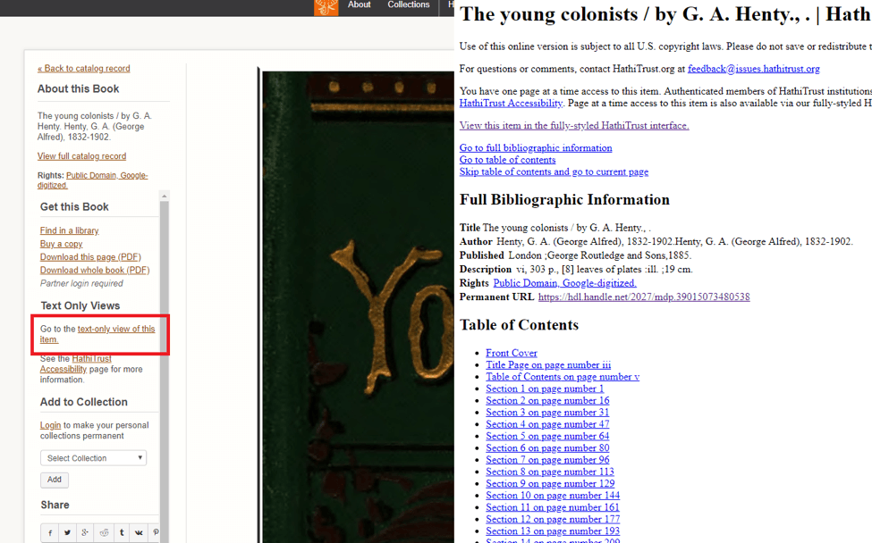
1.4. Text only version (See example 1.4)
2.1/2.2. Result title with heading tags (See example 2.1/2.2)
3.1. Context-sensitive instructions/tips (See example 3.1)
Examples:
1.1/1.3/2.1. Simple result structure with result layout option and result title: Good design
Artstor organizes the result structure simply and also provides layout options and a result title.
1.4. Text-only version: Good design
HathiTrust provides textual description – text view.
2.1/2.2. Result title with heading tags: How-to example and Good design
Apply HTML heading code to a result title
e.g., <h2>Search Result # items found</h2>
Artstor applies the HTML heading code <h1> to result title. 
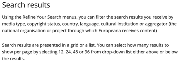
3.1. Context-sensitive instruction/tips: Good design
Europeana provides tips for search result layout.
Related Resources:
-
- Russell-Rose, T. (2013). Designing Search: Results Pages. Retrieved from https://uxmag.com/articles/designing-search-results-pages
- Xie, I., Babu, R., Joo, S., & Fuller, P. (2015). Using digital libraries non-visually: Understanding the help-seeking situations of blind users. Information Research: An International Electronic Journal, 20(2), paper 673. Retrieved from http://InformationR.net/ir/20-2/paper673.html.
- HathiTrust (2018). Retrieved from https://babel.hathitrust.org/cgi/pt?id=mdp.39015073480538;view=1up;seq=1
- W3C. (2018). WCAG 2.1 Guideline 2.4 Navigable. Retrieved from https://www.w3.org/TR/WCAG21/#navigable
- W3C. (2018). WCAG 2.1 Guideline 3.2 Readable. Retrieved from https://www.w3.org/TR/WCAG21/#readable
- W3C. (2018). WCAG 2.1 Guideline 3.2 Predictable. Retrieved from https://www.w3.org/TR/WCAG21/#predictable
See also:
Help-seeking Situations > F. Confusion about multiple programs, DL structures, or search results structure


