Situation Definition:
A situation that arises from difficulty either understanding or using a feature of a DL.
Factor(s) Leading to the Situation:
-
- Inadequate knowledge:
- Inappropriate labeling:
- Unclear instruction:
- Inadequate knowledge:
Guideline or Design Recommendation:
-
- Label a feature and its components in a way that reflects their functions based on user expectations
- Explain how to use a feature effectively
- Offer assistance in interacting with a feature
Rationale and Objective:
For designing general DL features and functions, the first consideration might be whether the website is designed in alignment with the goal or mission of the DL (1). Within this framework, features or functions should be designed based on the expectation of users. For example,
users may need clarification on the purpose of a feature and instruction on how to use it. Instructions for each feature or function should be clearly described. For example, step-by-step tutorials or context-sensitive instruction alongside the feature would help users interpret which commands need to be applied to activate the feature. Instructions for features should be described clearly in common language. Many DLs use images or visual symbols, which might be effective for sighted users but may present a problem for BVI users. Textual descriptions of functions are needed for BVI users (2). Since displaying too many filter options may confuse a user, some options can be provided as Advanced Search features.
Techniques and Methods:
1.1. Design the
of a feature indicating its function based on user needs derived from a user study or user feedback
1.2. Provide text labels and descriptions (which may incorporate invisible text for sighted users,) rather than images
1.3. Use
–
to make DL features accessible to screen readers
1.4. Provide “label” html code to specify the label and/or function of a feature
1.5. Apply measures for reading level (e.g., Flesch-Kincaid grade level) to improve the readability of labels and instructions
2.1. Provide step-by-step instructions/tutorials for each feature
3.1. Provide
tips to explain how to use a feature
3.2. Provide feedback while a user is interacting with a feature
Recommended Features:
1.1. Intuitive and specific feature
(See examples 1.1.a and 1.1.b)
1.2. Text label and description (See example 1.2)
1.3. Accessible features using WAI-
(See example 1.3)
1.4. “Label”
code (See example 1.4)
2.1. Clear instructions, step-by-step tutorials, or demonstrations (See example 2.1)
3.1.
tips (See examples 3.1.a and 3.1.b)
3.2. Text and sound alerts (See example 3.2)
Examples:
1.1.a. Clear labels: Good design
Use intuitive and specific terms in the label of features
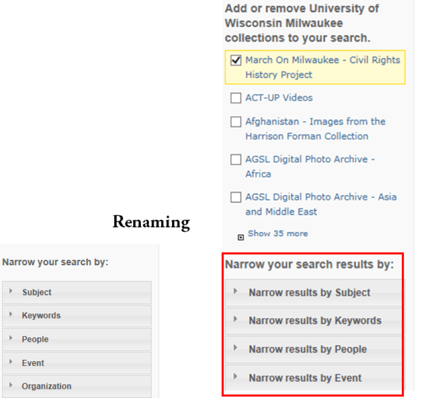
1.1.b. Clear labels: Bad design
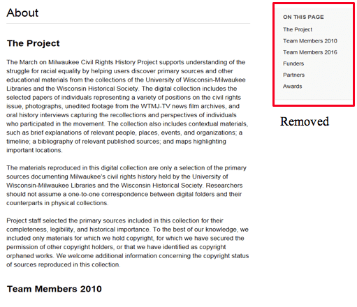
On the page, headings are already provided so the subheading list on the right side causes duplicate heading lists. This takes longer to move around. Removing features that are difficult to access is recommended.
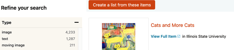
1.2. Test label and description: Good design
Features have simple and adequate text description.
1.3. Use WAI-ARIA: How-to example (W3.org)
A link displays a pop-up box and aria-label allows screen readers to read a Close button in a pop-up box.
<div id= “box”>
This is a pop-up box.
<button aria-label= “Close” onclick= “document.getElementById(‘box’).style.display= ‘none’;” class= “close-button”>X</button>
</div>
1.4. Use “Label” html code to features: How-to example
French</label> <input id= “French” type= “checkbox” name= “dressing1” value= “checkbox”><br>
<label for= “Italian”>Italian</label> <input id= “Italian” type= “checkbox” name= “dressing2” value= “checkbox”><br>
<label for= “Russian”>Russian</label> <input id= “Russian” type= “checkbox” name= “dressing3” value= “checkbox”>Retrieved from https://www.afb.org/aw/5/2/14763
2.1. Clear instructions, step-by-step tutorials, or demonstrations: Good design
Europeana Help page provides a step-by-step tutorial for how to search (Europeana, 2018).

3.1.a. Context-sensitive tips: Good design
Invisible text is added to provide an overall description of the structure: In the red box, BVI users can hear “The search results section consists of three areas: sorting options, display options, and a list of search results.”
3.1.b. Context-sensitive tips: Good design
Invisible text used in red boxes so that a screen reader user can read detailed descriptions.

3.2. Text of sound alerts: How to example
Add ARIA-alert role to notify of the alert
<h2 role= “alert”> You did not put your address </h2>
You can find more information from w3c.org and Mozilla.org.
<button id= “alert-trigger”>
Trigger Alert
</button>
<div id= “example” role= “alert”></div>
<!– The following script element contains the content that will be inserted into the alert element. –>
<script type= “text/template” id= “alert-template”>
<p><span lang= “da”>Hej</span>, hello, <span lang= “it”>ciao</span>, <span lang= “ja”>こんにちは</span>, <span lang= “ko”>안녕</span></p>
</script>
Related Resources:
-
- Wax, D. (2008). 7 Essential Guidelines For Functional Design. Retrieved from https://www.smashingmagazine.com/2008/08/7-essential-guidelines-for-functional-design/
- Xie, I. & Cool, C. (2009). Understanding help seeking within the context of searching digital libraries. Journal of the American Society for Information Science and Technology, 60(3), 477-494.
- Babich, N. (2017). Best Practices for Search Results. Retrieved from https://uxplanet.org/best-practices-for-search-results-1bbed9d7a311
- W3C. (2018). WCAG 2.1 Guideline 3.2 Predictable. Retrieved from https://www.w3.org/TR/WCAG21/#predictable
- W3C. (2018). WCAG 2.1 Guideline 3.3 Input Assistance. Retrieved from https://www.w3.org/TR/WCAG21/#input-assistance
See also:
Help-seeking Situations > C. Difficulty with help